With the research done on the current problems & shortcomings of the Brixwork UI, I had now developed several ideas to implement. This wouldn’t be all of course, as these projects have a tendency to present new challenges to overcome along the way.
. . . .
Several changes I decided upon & implemented right away
#1 – Better information layouts with more colour coding, better separated information blocks
It takes up more vertical space than the previous single-row visual, but it’s much easier to use. Besides, vertical-scroll is a more preferred way to organize pages due to the popularity of tablets which allow you to swipe up/down easily, as well as scroll-wheels becoming a standard accessory on most consumer mouses sold.
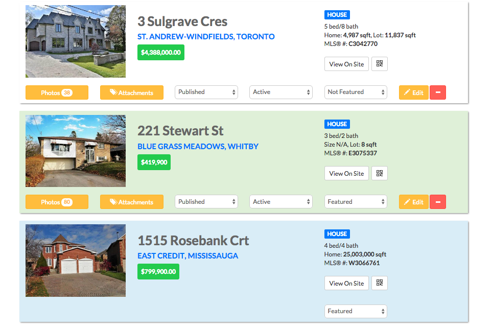
Featured MLS® in blue, OWN featured in green – a more intuitive colour coding system.
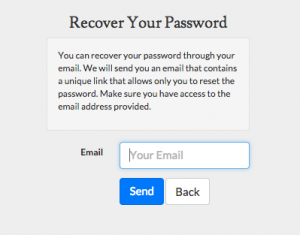
#2 – Email based logins
With the lack of frequency in logins, usernames were forgotten. By transitioning everybody into email-based authentication, I was also able to introduce an email-based password recovery system. Frankly, I am about 5 years behind on this one. Facebook, Twitter etc. all now use emails as the exclusive way of logging in.
#3 – Warning prompts
To start out, setting up users, changing passwords etc. are accompanied with tooltips on boxes, as well as pop-up warning modules. Duplicate emails, weak passwords etc. are addressed more clearly.
#4 – Adding buildings on the fly
Previously, while entering a new listing that was part of a brand new building never set up in the system, you had to add the listing, go to the BUILDINGS tab to set this up, then come back to the HOMES tab to link that listing to the newly created building. This is all done via AJAX on the fly, by checking for the address. If the building exists, then a dropdown is generated with the matching building pre-selected.
#5 – Better mobile presence with the mobile-first CSS framework, Bootstrap
This also comes with many useful and easy UI components and modules which make communication easier.
#6 – Grouped navigations
All sections revolving around listings (Homes, Buildings & Cities) are now grouped into one dropdown. Users/Agents are also grouped up as well.
Reducing the need for a user manual
Another amazing effect of the above upgrades which flow more like that of a human brain’s logical journey of getting work done is that we will have clients rely less and less on user guides. Although our support centre has a robust amount of articles and video tutorials, we should be designing the software so that people do not even need to refer to it so much.
Intuitive > Instructions
A user interface that flows to the natural thought process is more intuitive. Also, on-screen prompts that alert the user of all the warnings & issues make the process more self-explanatory. Intuitive software does not require too much instruction. Very few people had to look through the iPad manual to learn how to use it.