If you have been in the photoshop world for a few years (like myself) you’ll know that the TV screen effect has been around for nearly 10 years now. I learned it first in the late 90’s when I was a scrawny little kid playing with Photoshop 5.0!!! In this post I will show you a slightly different technique of emulating an LED screen (one of those gigantic screens with rather large LED bulbs on it that you see on city buildings, concernts, events, etc.), and also I will cover how to emulate a conventional TV screen effect (although conventional CRT TVs are now fading away…).
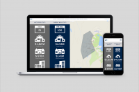
These tricks are not too difficult nor time consuming, yet it can add a good edge to your web-design work or any other design work, and satisfy yourself or your clients. Here is my sample of the Photoshop file that I actually worked on with this project. Download it and inspect it if you like.
- First of all, I will remind you (or educate you) that this type of effect relies on using patterns, and filling a layer with patterns. So first, let’s create the pattern. I will start with the LED screen effect first. Depending on what kind of effect you want to achive, and what your taste is for thsi job, set the width/height of a new document. I will choose 4X4, so 16 pixels in total. But you may go as small as 2X2 if you like, or go larger. I’m assuming this job is for the web, so I’m sticking with RGB mode. If you plan to print this, you should be using Illustrator.
 Remember that a classic LED screen has square cells, not rectangles, so it’s best to keep the width/height identical, unless you have a radically different idea.
 - Let’s start painting. To make this screen universally available for any color mode, I will choose to use grayscale colors only. But if you know what color tone you will be using over it, you can use that specific color. First, zoom in as much as you can, since we are working with a 4X4 cell. Then, select the pencil tool, and set the brush to 1 pixel. Just to make it easier to visualize, I will paint the whole thing in a darker grey for now. Remember that this pattern consists of a darker surround and then a lighter central region that shows the highlight of each bulb.Time to set the highlight color, and I chose #d1d1d1. This will be the color of the lighter part of things. I chose a cell near the top-right but not on the corner (so in this case, cell # 7) as the center of the highlight.Then we need to spread the colors out a little bit so it’s not too jagged. You could use this as a pattern right away if your artwork suits it, but I will choose to smoothen it a bit. On your pencil tool attributes at the top set the opacity of the pencil tool to 50%. (note it should have been at 100% for the previous strokes!)Next, let’s carefully paint some cells around the highlighted edges with the 50% opacity pencil tool. I only chose 4 cells or so that were directly touching the highlight cell, and left the diagonal ones untouched, as you can see. At this point, even if you are using a color instead of a grey, you should see a lighter shade of that color. That’s the advantage of using the pencil tool with 1 color only and cascading it down – you keep the color consistent, and for those who have even less sense of which colors are darker/lighter, it takes the guess work away from you!!!Now, let’s carry on with more painting. Set your pencil to have 30% opacity, and carry on with some more cells. And then 15%. And then at 5%, you can touch up some other cells to lighten them slightly here and there to give it a natural look. And here is my finished pattern product!!!
Note that most patterns require you to match the cells of the opposite end so that when it is knitted to a pattern, they match up completely without abreak. But don’t worry too much about it on this one – as long as the changes are not drastic (which they are not) it should be fine, because the patterns are so small and it’s meant to create the effect of LED bulbs poking all over, with valleys and peaks of coloring. - In this step we will save this as a pattern so that we can use it in the actual document you want to use it with. Go to Edit > Define Pattern, and type in a name for this pattern that is descriptive.So now the pattern is saved for universal use, and you can carry on to the next step which is the beginning of your actual artwork.
- My new website banner needs to be 768 X 125, so let’s start the document. The screen has to go on the entire page, so I will need a layer that covers the whole artwork. The easiest way to do it right off the start is to right-click on the “background” layer, and click “Duplicate”. Let’s name this layer “LED Screen”.Once the layer is set, let’s right click on that layer, and go to “Blending Options”, and click on “Pattern Overlay”. Make sure you click on the “Pattern Overlay” title, not just the checkbox, so that you can see the options for the pattern overlay. By default you will get the first pattern on the patterns list. The last pattern on the patterns list should be the pattern we just created in the previous steps. Select it. (another way to create a pattern layer is to go to Layers > New Fill Layer > Pattern on the top menu, but I just prefer this way because I have easier access to the pattern options under the Blend Mode so I can easily change the scale/opacity later)Let’s set the opacity of the pattern to 50%, or somewhere around there. This is an overlaying pattern over other artwork to create that effect, so it doesn’t have to be that strong. You can do this OR you can set the entire layer’s opacity lower later. This depends on how you intend to overlap layers later.Note that in my design, since I used the neutral colors of greyscale for my pattern, I can change the color tone of this layer all I want by clicking on “Color Overlay” and setting an overlaying color. You want both the pattern and the color to show, so set the opacity of this color overlay lower as well – you have the flexibility to do whatever you like. In my case, I will choose maroon as my overlaying tone and I will put in 50%.
- Once that is set, you will see the following image :We have a color overlay, AND the pattern overlay Set in. Now, this pattern still looks rather boring to me. Let’s add soem goodies to it to spice things up.
- The first thing I want to do is put a gradiation over it to give it some shade and volume. Let’s create a new layer first by clicking the “New Layer” button ( the one that looks like a piece of paper folded at the corner) in the Layers box. This will create a new layer that has nothing on it. Put this layer to be on top of our pattern layer. For the sake of distinction, name it “gradient layer”.Once this layer is in, let’s select the Gradient tool. On the Gradient tool options, I will select the option that allows you from going to color to transparency. It looks like this :Once that is selected, let’s put that over the new layer we just created. Put it from the edges to the center so that you get a black mist effect on the outskirts of the frame. Here’s how mine looks :Once this is set, set the layer opacity of the gradient layer to be lower, so that you can still see the pattern at times.
- Now, I want to put a background image in there that blends in with the patterns. Let’s choose a photo that is large enough to fit the entire length of our frame. I opened a new photograph, cropped it to the parts I want to use, and then I set the width to 768. Let’s select the entire photo (Ctrl + A) and then copy it (Ctrl + C).Go to our banner file on Photoshop. Paste it (Ctrl + V). The photo will go in as a new layer automatically. Put the new photo layer in between the “gradient layer” and “Led Background”, and then set the layer opacity to be lower so that the pattern can show through.
- Now that we got this far, it’s time to make some minor adjustments. Adjust the opacity of the “Color Overlay” and “Pattern Overlay” of the “LED background” layer. Also play with the opacity of the “Gradient Layer” as well as the newly created photo layer. Each project has different color tones and different photos and what not, so at the end it’s all about fine-tuning it for the best optical effect.There is my final product after adjustments.
 Remember that a classic LED screen has square cells, not rectangles, so it’s best to keep the width/height identical, unless you have a radically different idea.
 Let’s start painting. To make this screen universally available for any color mode, I will choose to use grayscale colors only. But if you know what color tone you will be using over it, you can use that specific color. First, zoom in as much as you can, since we are working with a 4X4 cell. Then, select the pencil tool, and set the brush to 1 pixel. Just to make it easier to visualize, I will paint the whole thing in a darker grey for now. Remember that this pattern consists of a darker surround and then a lighter central region that shows the highlight of each bulb.
 Time to set the highlight color, and I chose #d1d1d1. This will be the color of the lighter part of things. I chose a cell near the top-right but not on the corner (so in this case, cell # 7) as the center of the highlight.Then we need to spread the colors out a little bit so it’s not too jagged. You could use this as a pattern right away if your artwork suits it, but I will choose to smoothen it a bit. On your pencil tool attributes at the top set the opacity of the pencil tool to 50%. (note it should have been at 100% for the previous strokes!)
 Next, let’s carefully paint some cells around the highlighted edges with the 50% opacity pencil tool. I only chose 4 cells or so that were directly touching the highlight cell, and left the diagonal ones untouched, as you can see. At this point, even if you are using a color instead of a grey, you should see a lighter shade of that color. That’s the advantage of using the pencil tool with 1 color only and cascading it down – you keep the color consistent, and for those who have even less sense of which colors are darker/lighter, it takes the guess work away from you!!!
 Now, let’s carry on with more painting. Set your pencil to have 30% opacity, and carry on with some more cells. And then 15%. And then at 5%, you can touch up some other cells to lighten them slightly here and there to give it a natural look. And here is my finished pattern product!!!
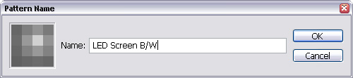
 My new website banner needs to be 768 X 125, so let’s start the document. The screen has to go on the entire page, so I will need a layer that covers the whole artwork. The easiest way to do it right off the start is to right-click on the “background” layer, and click “Duplicate”. Let’s name this layer “LED Screen”.Once the layer is set, let’s right click on that layer, and go to “Blending Options”, and click on “Pattern Overlay”. Make sure you click on the “Pattern Overlay” title, not just the checkbox, so that you can see the options for the pattern overlay. By default you will get the first pattern on the patterns list. The last pattern on the patterns list should be the pattern we just created in the previous steps. Select it. (another way to create a pattern layer is to go to Layers > New Fill Layer > Pattern on the top menu, but I just prefer this way because I have easier access to the pattern options under the Blend Mode so I can easily change the scale/opacity later)Let’s set the opacity of the pattern to 50%, or somewhere around there. This is an overlaying pattern over other artwork to create that effect, so it doesn’t have to be that strong. You can do this OR you can set the entire layer’s opacity lower later. This depends on how you intend to overlap layers later.
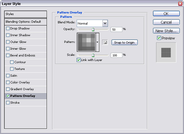 Note that in my design, since I used the neutral colors of greyscale for my pattern, I can change the color tone of this layer all I want by clicking on “Color Overlay” and setting an overlaying color. You want both the pattern and the color to show, so set the opacity of this color overlay lower as well – you have the flexibility to do whatever you like. In my case, I will choose maroon as my overlaying tone and I will put in 50%.
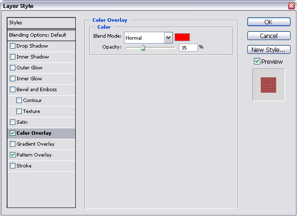
 We have a color overlay, AND the pattern overlay Set in. Now, this pattern still looks rather boring to me. Let’s add soem goodies to it to spice things up.
 The first thing I want to do is put a gradiation over it to give it some shade and volume. Let’s create a new layer first by clicking the “New Layer” button ( the one that looks like a piece of paper folded at the corner) in the Layers box. This will create a new layer that has nothing on it. Put this layer to be on top of our pattern layer. For the sake of distinction, name it “gradient layer”.Once this layer is in, let’s select the Gradient tool. On the Gradient tool options, I will select the option that allows you from going to color to transparency. It looks like this :
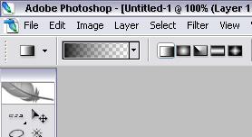 Once that is selected, let’s put that over the new layer we just created. Put it from the edges to the center so that you get a black mist effect on the outskirts of the frame. Here’s how mine looks :
 Once this is set, set the layer opacity of the gradient layer to be lower, so that you can still see the pattern at times.
 There is my final product after adjustments.
Now, to the TV screen effect : I tricked you, I won’t show you how to do it. But since you can create the LED screen effect now, the TV screen effect should be a simple piece of cake. Remember that a TV screen consists of 2 lines alternating. So all you need is a starting pattern that is 1 pixel wide and 2 pixels tall, the top cell being the white one and the bottom cell being the black one. And then the rest of the steps are the same. If you want to see an example of a TV screen effect go to this website I am building right now.